AMACCAO Group’s AVIA beverage brand has a new brand identity
(Dan Tri) – With a new brand identity, the AVIA logo has a prominent focus on a rooster crowing. The image shows both the traditional features and the aspiration of the new and brilliant with the symbol “catching the sun”.
![]()
After many years of development and becoming a familiar beverage product, AVIA – a member unit of the AMACCAO Group decided to change its brand identity. The change was announced after a long time of deliberation, in order to give AVIA the opportunity to renew itself as well as to refresh the emotions of AVIA’s consumers.
Change your identity, get ready for a new experience
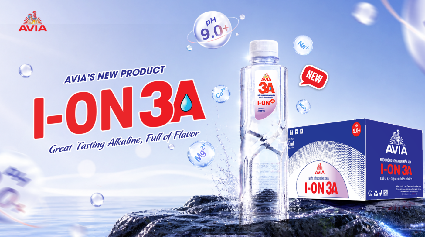
AVIA bottled water is a product known to many consumers, with the logo A in a red circle, which is sold a lot in supermarkets, restaurants, hotels, and eateries…
![]()
A business representative said that AVIA’s revenue from drinking water has grown at an average rate of 30% per year from 2014 until now. Although it was born not too long ago, it has been able to compete with the world’s big brands in the domestic market and at the same time export to foreign countries.
![]()
AVIA always strives every day to improve the quality. In parallel with product quality improvement, the company decided to change its logo to improve its identity, ready to break through, ready to renew itself.
Changing the logo is considered by the company because the old brand identity is so familiar and successful. However, AVIA’s new logo with the image of a rooster, the sun symbol, and the words AVIA is expected to bring both new and traditional emotions to customers.
“Traditional” is the essence perceived by customers in the taste of each AVIA water bottle. “Traditions” are Vietnamese products that are presented on Vietnamese rice trays and dishes, offered to ancestors on sacred occasions of the Vietnamese people. Mr. To Van Nam – founder of AMACCAO – the group that owns the AVIA factory – is very enthusiastic and concerned about Vietnamese water products for Vietnamese people.
He wanted the traditional “sweet” taste like natural rainwater in every bottle of AVIA water sold to each customer. But it seems that it is not enough, the traditional “taste” that the company’s leaders want to aim for needs to be fully expressed in the brand logo, next to the bottle or water product.
“Vietnam is a country rich in tradition and has a long-standing culture. AVIA’s products are also developed to spread that spirit. This is also the inspiration for the birth of the new logo,” the leader said. AVIA factory manager explained.
![]()
Why choose the image of a rooster?
The change of the AVIA brand identity logo took place in the context of many changes within the factory. The company has constantly invested in better filtration lines, in order to retain more minerals for the product. Bottle designs are also more diverse with many forms, designs, and capacities.
As for the logo, AVIA’s factory leadership emphasized “it’s time to change”. Instead of the circled A symbol, now the image of An Nam rooster on each AVIA water bottle is like standing on the mountain to welcome the sun with a ready-to-explode, ready for bright and brilliant new beginnings. more brilliant and surprising…
The 3 main colors in the new logo are red, yellow, and blue, which also represent determination and aspiration, bright beginnings.
In addition, the change of the logo this time is also to make it easy to identify and to have the homogeneity between wine and water in the symbol of the rooster – a very Vietnamese symbol, both familiar, healthy, and serious. hard-working. Although there may be initial difficulties in sales, the factory’s leadership is “not afraid of difficulties and sufferings”, determined and persistent to develop.
According to AVIA representatives, the new logo will consist of 3 parts. In particular, the word AVIA (Member of AMACCAO GROUP) is the brand name and also the symbol for the towering and steady foot of the mountain. This is a solid fulcrum for the An Nam rooster to stand firmly to reach high, reach far, and raise the crowing sound that echoes all over the world…
![]()
Next, the sunshine icon part is an image of sunshine, brilliant dawn signaling a new day has arrived. Dawn is the beginning and the beginning always brings new, unexpected, and brilliant things like new opportunities ahead waiting for AVIA’s rooster Anna.
Finally, the most focal part is the image of a rooster raising his voice to welcome the dawn to dispel the darkness. The rooster crowed like a sound sprouting from the ground, soaring into the sky and echoing everywhere.
Explaining more about the reason why the new logo was chosen with the image of a rooster as the center, AVIA leaders said that the rooster is a familiar animal to Vietnamese people. This is also a symbol with many profound meanings in ancient books, myths, or folk beliefs…
![]()
In ancient books, the rooster is the symbol of the five virtues with literature – martial arts – courage – humanity – faith. The head wearing a hat (the cock’s crest) is “van”: The cock’s crest stands tall and straight, showing the will. Fast walking is a “martial art”: the rooster usually takes the lead and leads the whole flock of chickens, and the chicken’s gait is strong and agile. In danger, it is “brave” to dare to fight: by moving flexibly, quickly, and with a few correct pecks, the rooster can fight other species such as snakes, centipedes, etc. to protect their chicks. There is a piece of food that knows how to call the flock “human”: When meeting a place with food, chickens often cry out so that the whole flock comes out to eat together. Always guarding at night is a “sign”: Roosters often go to bed early and stay up at night, the rooster crowing signals the time for everyone.
![]()
In mythology, the symbol of the chicken appeared from the Chinese story Hou Yi shot down the sun. When Hau Nghe shot down 9 suns, the 10th sun was scared and hid behind the clouds, human life was in darkness. People and all things took turns calling the sun unsuccessfully, when the rooster crowed, the sun, when he heard the rooster crowing, came down to make the earth shine again. Since then, the rooster mascot has been worshiped by many people and the rooster crowing has become a sign of dawn.
In folk belief, each flock of chickens has only one leader rooster, which will lead and find food for the whole flock. Every time when worshiping gods or ancestors in the tray, it is indispensable to have a chicken. The rooster is seen as a bridge between humans and the divine world. The chicken is close to the farmer, so the chicken symbol becomes a symbol of prosperity, fullness and time. The image of a chicken standing on a high mountain calling for dawn becomes a symbol of courage and majesty.
It can be seen that this is a very familiar and very Vietnamese symbol that helps customers and partners easily identify, and at the same time shows the unity between water and alcohol – two key products that AVIA wishes to write a sentence about. personal issue.
![]()
Through the image of a rooster, AVIA also conveys the wish that with this new logo and identity, AVIA’s products will come closer to each citizen, appear in every Vietnamese tray, and be the pride of Vietnamese people. about a Vietnamese product with outstanding quality.
The enthusiastic investment in products and images is a commitment of AVIA to continuously bringing value to consumers, becoming a strong brand in the beverage industry in Vietnam, and gradually conquering the market international.